This is embargoed until 5 am EST Tuesday.
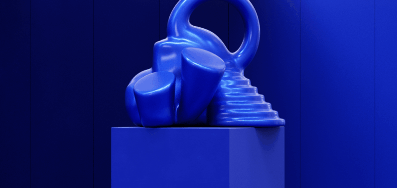
WGSN, a consumer trend forecasting service, and its sister company Coloro have named “Luminous Blue” as the 2027 “Color of the Year.”
The company also has introduced its five key colors for spring-summer 2027 that are said to borrow from tradition, culture and wisdom to relay a sense of being grounded and resilient. Those key choices are Luminous Blue, Energy Orange, Pop Pink, Meadowland Green and Clay. As their names suggest, the first three are lively and buoyant hues that from WGSN’s view will help people rise above the stresses of the world.
The earthier and more staid Meadowland Green and Clay were inspired by consumers’ search for purposefulness and meaningful connections through community and nature. The pressures of a polycrisis in 2027 – the convergence of war, climate change, epidemics and energy issues and other problems – are also expected to spark interest in the earthy pigments, according to WGSN.
The limitlessness of colors recently surfaced in the news, after scientists at the University of California, Berkeley, said they had discovered a new color, “olo,” that cannot be seen by the naked eye.
A team of 18 hailing from cities like London, North America, São Paulo and China pitched in this season to pick the 2027 color of the year, according to WGSN’s senior color strategist Clare Smith. “Quite constant, inspired, vivid and immersive,” Luminous Blue also has a familiarity, which will be key on the commercial level going into 2027, she said.
Discussions about Luminous Blue led to such topics as natural-made pigments and semi-precious stones. This Yves Klein-like cobalt also conjured up “the idea of being traditional in class, but also blending with AI advancements,” Smith said. Interconnectedness was top-of-mind for the WGSN team in relation to society, technology, environment, politics, industry and creativity. “You can’t talk about one without the other now. That’s a driving force with color as well,” she said. “When we are still in such uncertain and fluctuating times, this idea of you-can’t-have-me-without-the-we speaks to this color.”
WGSN launched a color-coding system, Coloro, in partnership with the China Textile Information Center in 2017. Before selecting any trending colors, the WGSN team reviews “thousands and thousands” of colors in a workshop, but the process is “really intuitive,” Smith said.
From WGSN”s standpoint, Color of the Year comes down to how brands can use the color, and whether it would stand out for a whole year. Relatability is another upside to Luminous Blue, Smith said. “It feels very workable and achievable, which is what we want from a color of a year.”
Smith said the 2027 Color of the Year could play into the hue of the suits that Blue Origin’s all-female crew wore for their space travel but while space travel can’t be ignored, due to all of the advancements that are happening in that area, Luminous Blue is more of a combination of natural forces with a technology AI undercurrent. While Pantone specialists have spoken about the influence of space travel on color palettes, Smith said, “We don’t look directly at what Pantone is doing. We work with Coloro. We definitely see the influence of space travel on other key colors, but not on our Color of the Year.“
Key Colors for spring-summer 2027
Luminous Blue
125-28-38: Richer than Citibank’s logo and flashier than royal blue, this cobalt started cropping up on some spring 2025 runways, thanks to Loewe, Ralph Lauren, Alberta Ferretti, and brands like Cos, Banana Republic and Adidas.

Energy Orange
Image Courtesy
Energy Orange
018-57-34: Dutch soccer fans aren’t the only ones who favor this high-octane orange. The “Oranje,” the national team of the Netherlands, wears this high-intensity orange as a nod to the Dutch royal family, the House of Orange-Nassau. Designers like Abra, Giambattista Valli, Chocheng, and Alexander McQueen have worked this shade into their runway collections. Per WGSN, “This bright orange corresponds to the consumer desire for safety and protection.”

Pop Pink
Image Courtesy
Pop Pink
151-73-22: Greta Gerwig and Margot Robbie helped to kick off an all-summer pink trend with the release of the feature film “Barbie” in July 2023, and consumers’ fondness for the color hasn’t fully waned. While Blackpink’s Rosé served up her take on pink in the music video for “APT,” Carven, Akris and Balmain have served up styles in Pop Pink.

Meadowland Green
Image Courtesy
Meadowland Green
050-61-19: “Wicked” actress Cynthia Erivo did her share to boost green’s popularity among the masses, but Meadowland Green is more of subdued shade. Labels as diverse as Victoria Beckham, Sandy Liang, Lee and Free People have tapped into this color.

Clay
Image Courtesy
Clay
014-60-13: With a dash of pink, this one is softer than the foolproof neutral that stands the test of time. While Thom Browne, Another Tomorrow, and Gap have been known to mold their fashions with more traditional grays, Clay offers an almost dusty pastel option.

