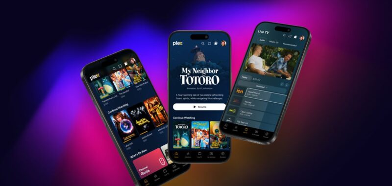
Plex is beginning to test its “newly reimagined Plex experience,” which will be available first on mobile and is coming to TV platforms “very soon.” Plex says the new experience has been in development for almost two years and is “designed to bring everything you love into one seamless interface.” But don’t worry — while the new version of the app is currently missing some features, Plex says it will be “closing those gaps” and will keep the current app available during the preview, which will hopefully prevent a Sonos-like debacle.
A big change for the new app is redesigned navigation that more clearly delineates between media you might have on your Plex server and the company’s streaming and on-demand offerings. The bottom bar has dedicated tabs for your media libraries, live TV, and on-demand movies and shows. The Watchlist, which lets you make a list of things you want to watch, has a spot at the top of the app. And artwork is shown more prominently.
Under the hood, Plex says that it has rewritten its apps and unified its codebase to create a more consistent experience. “With this new unified approach, our team can collaborate across platforms seamlessly, ensuring that each new feature, update, and improvement is available on most platforms from day one, once the migration is complete,” according to Plex.
To start, features like playlists, casting, and watch together aren’t available in the preview (you can see the full list of what’s not yet included in a forum post). But the company plans to push preview updates weekly ahead of fully launching the new apps in early 2025.
If you want to try the redesigned Plex apps for Android and iOS, check out the instructions on the company’s forums.

